Interior Design Color Trends For 2022
Interior design Trendy colors 2022: in terms of colors, the trend is towards a great softness. Telluric brown, powder pink, air blue or soft green: we reveal the perfect shades for a current and terribly cocooning room!
A cocoon-style room,
Materials and colors: we leave nothing to chance, especially not in the room. In addition to the choice of colors, we take care of the finishes, matte and velvet are more essential than ever.
If we still dare the monochrome color, then we make sure to work the materials. For a Japandi spirit (color palette dominated by neutral, natural colors such as creme, white, olive, beige, and muted brick red), we bet for example on wood.
This season, however, we prefer to combine different colors, and we do not hesitate to show a little audacity by imagining a graphic decoration. If you are afraid of missing out, opt for the combination of two complementary colors.
If you still like deep colors, you choose them a little less dark than previous seasons. Above all, we make sure to dose the contrasts: in the room we like them less pronounced.
The other unavoidable trend of the year is the camaieu, which simply consists of declining a single color by playing on its intensity: a bias that creates a cozy aesthetic ideal for the home decoration.
What colors for the room in 2022?
Neutrals and colors: if the color palette for the room of the year is soft, it lacks neither variety nor imagination!
Called Horizon Blue, this air blue slightly muffled with a hint of gray is ideal in the room. It is also rather clever if you crack on rattan: a material that it discreetly highlights.
If you fall for more sustained colors, dare a darker blue. For a resolutely trendy room, bet on the association with a terracotta or a burgundy.
Although green remains a safe bet in the room, it is also made in lightness. So, we crack without hesitation on the soft shades: sage green or celadon green.
Want a decoration that raises the tone? Adopt in this case the greens of character such as khaki green or olive green, more intense, but also terribly more subtle.
Although it is deep, the emerald green is also very bright: a particularity that makes it remain trendy in the room decoration.
In the room, we particularly fall for brown, an elegant color whose symbolism refers to stability. To balance the decoration, it is gladly associated with a cold color green or blue.
To discreetly illuminate the room, one can prefer a more subtle shade, opting for a brown that is tinted with ochre or amber.
Japandi spirit, Nordic inspiration, Mid-Century decoration, or chic countryside atmosphere: beige has the advantage of adapting to all decorative desires. Elegant, cozy, and bright, it is one of the trendiest colors in interior design 2022.
Between earth and sun, the ochre yellow is invited into the room, beware of too marked contrasts: to bring brightness to the decoration, we forget the white, and we opt instead for ecru, cream or beige.
The other warm color that has the wind in its sails this season is powder pink. In the room, we fall for the shades a bit clayey color or pulling on the terracotta color.
Far from being a newcomer, especially in the room, the terracotta color confirms that this year again, it will have to be counted on. That's good, because ecru, blue gray or ocher yellow: it combines perfectly with some of the most essential colors of the moment!
The colors on the deco side, in addition to the walls of the room, we take care of the textiles and home furniture, to achieve a trendy palette.
For a few seasons now, red has been knocking on our doors. This season, he seems determined to win. We fall for the carmine red, which subtly energizes the decoration of the room.
The year 2022 marks the return of the lilac color. This pale purple is particularly invited into the textile world: carpets, curtains, or bed linen.
Among the major trends of the year, we note the return of acidic colors, which awaken our interior residential. We therefore adopt the lemon yellow or the apple green by small touches, playing with the bed linen.
Orange is one of the character colors that beautifully twist the home decoration, we gladly fall for a coppery declination, easy to associate with lilac or blue.
Indigo blue was one of the essential colors of the year. In the room, it is particularly liked in combination with the eggplant color.
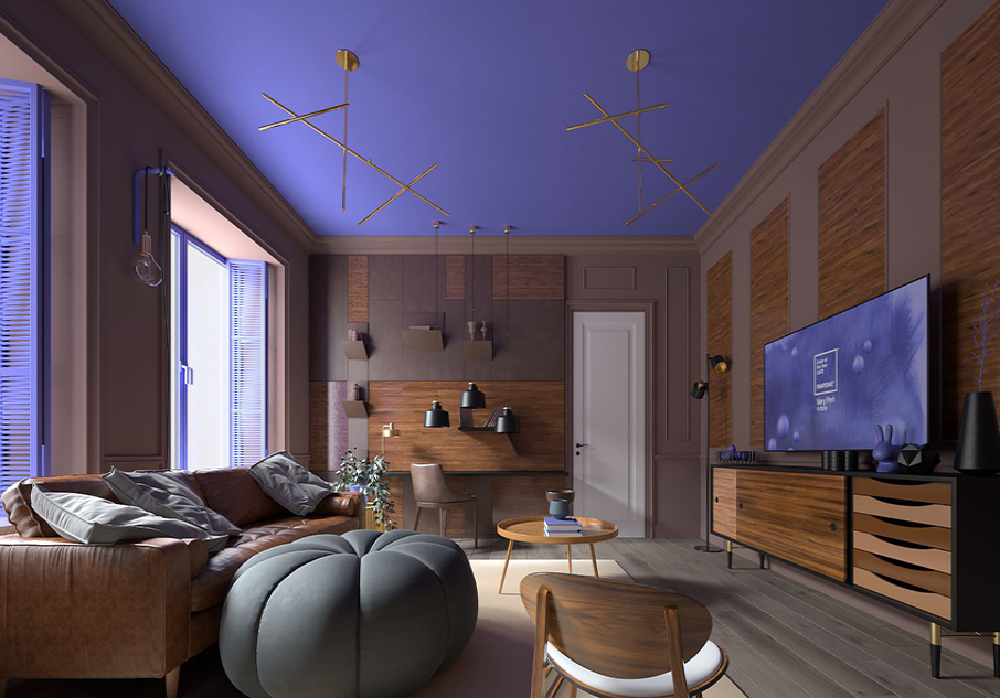
The New Pantone Colors in 2022 was finally unveiled to us. Here comes Very Peri, a dynamic periwinkle blue and, with it, a string of new Pantone colors to highlight it and sublimate our interiors.
Very Peri:
The choice of the color of the year answers above all a question about concerns and evolutions on a global scale, to propose a color that wants to be universal.
To succeed the yellow Illuminating and the Ultimate Grey, the duo that made the decoration vibrate last year, the Pantone Color Institute offers this year the color Very Peri, a mischievous periwinkle blue.
Displaying all the qualities of blue, a peaceful color, conducive to dreams and creativity, the Pantone 2022 color is enriched with red and purple pigments, which give it a dynamic and joyful touch.
The complexity of this new blue hue punctuated by a touch of purple red highlights the breadth of possibilities available to us."
Kea design company Dubai, uae offers a range composed of 4 chromatic palettes, each corresponding to a specific state of mind or atmosphere, to accompany its color of the year.
For a perfectly balanced interior, we rely on the Balancing Act palette. From Lotus, a powder pink, to Hawthorn Rose, this harmony declines sublime pink shades, which are part of the trend of the year. You can associate them with Granite Green, a natural green. Between warm and cold tones, these delicate colors nicely emphasize the vibrant character of the Very Peri color.
The Balancing Act palette offers subtle color combinations around Very Peri, ideal for awakening a bohemian interior dominated by neutral and bright shades such as ecru or sand color.
Combining natural nuances, the Balancing Act harmony is of course ideal to bring a touch of brightness to the decoration of our outdoor spaces. We hasten to adopt it on the terrace or on the balcony, playing with the accessories, but also with the materials.
These intense shades, illuminated by the invigorating freshness of the Very Peri color, bring a nice relief to the neo-Scandinavian interior.
With the Wellspring palette the color Very Peri at the heart of a fresh harmony, directly inspired by nature. This pretty declination of greens is warmed with a warmer color: Chai Tea, an amber shade very trendy this year.
This year, it's the Amusements harmony: a palette that focuses on exotic and gourmet warm colors. Pink Flambé, Paradise Pink or Tawny Orange bring out the warm side of the Very Peri color.
To bring a note of freshness, colors rely on Tourmaline, a gray blue that is reminiscent of Breath or Horizon Blue, colors of the year.
Colored glass is one of the major decorative trends in 2022. This material is even more sublime when it declines the new Pantone colors, as mischievous as they are luminous.
With these colors, the Amusements harmony seems reserved for a contemporary interior or inspired by the 1980s. Much more versatile than you might think, it also twists the neo rustic interior.
It could be taken for the wisest palette perhaps the most daring: the Star of the Show harmony lives up to its name. Dominated by muted colors, it literally visually explodes the color Very Peri.
For the year 2022, you can replace pure white with slightly muffled shades: enough on their own to create a cocooning atmosphere at home, it is also the nuances that fully reveal the power of Very Peri.
Pantone puts dark gray back on the front of the stage. We particularly like to play with textures to adopt these mineral nuances: concrete, gray parquet and, of course, natural stone.
Horizon Blue the deaf gray blue comes in a particularly subtle version, inspired by the mist that floats above a lake. a delicate color, which appears a pale blue or more shaded, depending on the time and brightness. this shade is largely sufficient. Perfect for introducing a discreet touch of color to the home, it is also associated with many trendy colors: lemon yellow or terracotta.
The least we can say is that the citron yellow lives up to its name. If the total look is too bold for you, adopt it by small touch. This dynamic yellow is ideal for adopting the Color Block trend
With the emergence of the warmer, unbleached color, one might think that white is out of the game. It is true that to stick to trends, it is a question of choosing it with the greatest care, betting on a chalky white. Contrary to what one might think, this color of a beautiful simplicity is not so easy to find.
To be in the trend, we adopt rich and deep nuances ... but not too much anyway. Perfectly balanced, the Berrington Blue is right in the tone. Muffled with a slight touch of black, it is as sublime in the living room or dining room as in the bedroom.
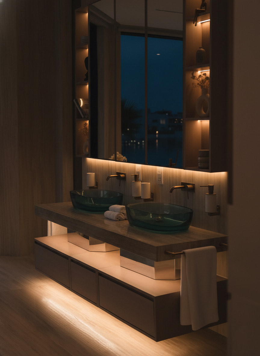
The bathroom is a very important room of the house: it is in this heaven of peace that we start and end the day. And this season, the trend is to the cocoon bathroom! To adopt it, we mainly play with color.
A sober and elegant bathroom
Very decorated, the minimalist bathroom remains a safe bet, which resists all trends. Although... If this season again, we fall for the white bathroom, we carefully avoid the total look bright, but not cozy enough. We work with white in combination with other colors, or even by combining different materials.
The tandem that works every time. White and light gray, which softens the decoration, without affecting the brightness. For the occasion, we bet on the concrete effect, always top trend, and which a contemporary bathroom as in a Japandi or ethnic chic decoration.
Black, grey, white... This season, we gladly bet on simplicity, adopting neutral colors privilege. The goal: to achieve a peaceful decoration, but which does not lack personality. For that, we have fun with the tiles, alternating formats, finishes, fit outs, and effects.
Revival Spirit
Is it the health crisis that produces funny effects on the decorative sphere? This year again, we look to the past, and to the most colorful periods. After the 50s and the sixties, it is today the years 1970 to 1990 that we like to revisit.
We particularly fall for wall decorations, which we hang as well in the kitchen as in the bedroom or in the living room.
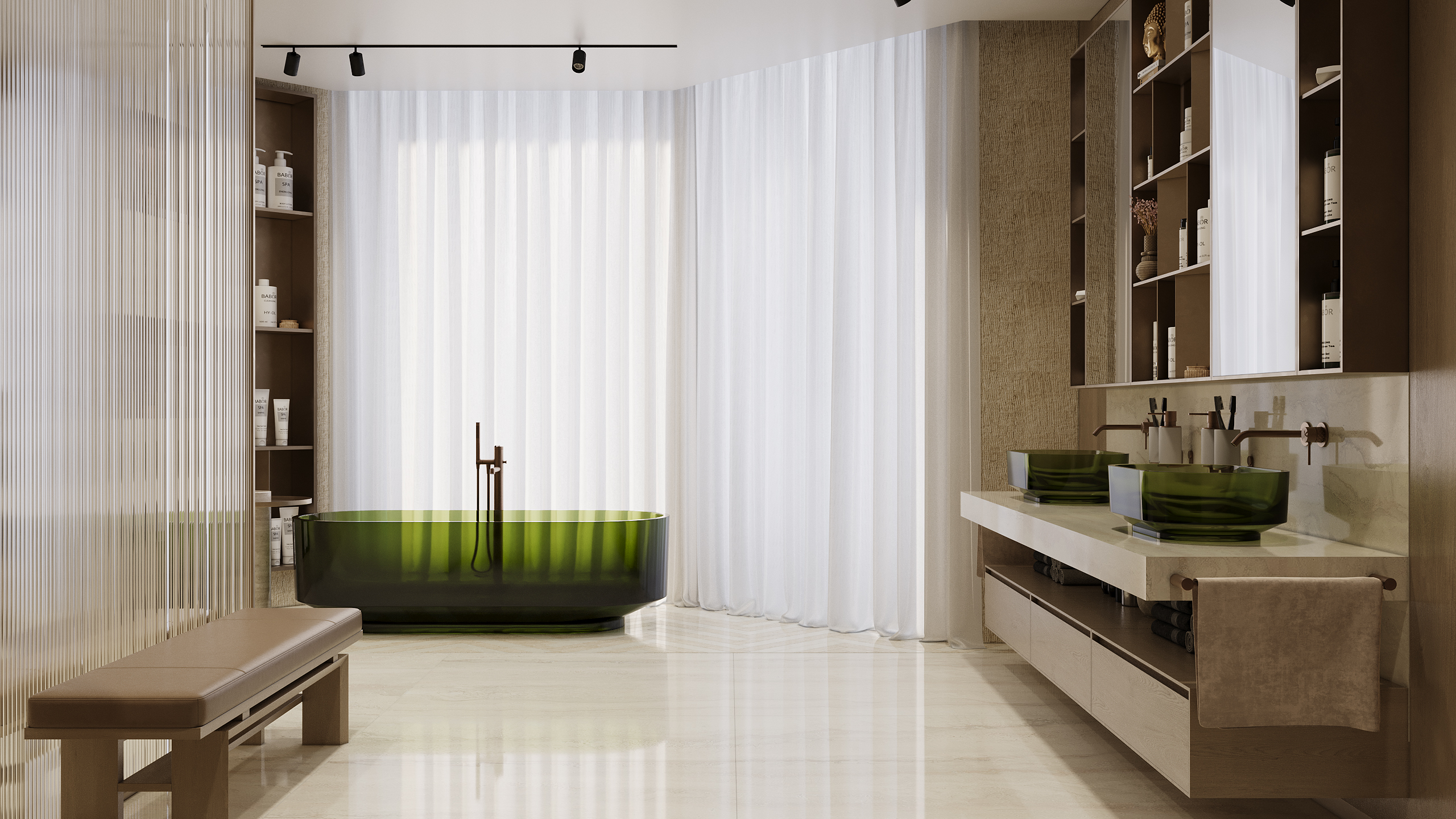
The spa-spirit bathroom
The big trend of the year is to think of the bathroom as an authentic spa at home. The storage is very small, and gives way to the bath, or the shower.
On the shower side, we fall for the walk-in shower, and preferably with XXL dimensions. The crucial element is the wall, which is chosen lightly, focusing above all on transparency.
On the shower side, we fall for the walk-in shower, and preferably with XXL dimensions. The crucial element is the wall, which is chosen lightly, focusing above all on transparency.
The high-tech bathroom
Minimalist lines and a slightly futuristic atmosphere: this year, the contemporary bathroom is taking Centre stage.
On the furniture side, we bet on a sleek design to the extreme. To stick to trends, favor suspended elements, focusing on asymmetry.
Between the decorative trend and the philosophy of life, minimalism seems to have invested our interiors in the long term. The principle of this refined decoration: an open space, bright, not very crowded, in which you feel good ... A program that seems to have been designed especially for the bathroom!
Tips to successfully decorate your minimalist bathroom
this does not mean ignoring the style, quite the contrary! To furnish a truly original minimalist bathroom, have fun with the materials, happily mixing materials, colors, and finishes.
To sublimate the decoration of your minimalist bathroom, let the eye circulate! We therefore forget the traditional partitions, which we replace with a claustrum or a glass roof.
In the minimalist bathroom, each element must be both functional and decorative. On the storage side, bet on well-thought-out furniture, and think about the suspended elements, which bring lightness. Do not hesitate to stage them, creating a graphic and asymmetrical composition.
Sophisticated sanctuary
Elegant, organic, and highly versatile, the grey green embodies the renewal and resilience of nature. Olive branch creates an elegant oasis in the bedroom and blends perfectly with brass accents and wood tones on lower kitchen cabinets.
Color specialists have developed three signature palettes under the theme Horizon, which represents the hope, reflection and renewal that characterize our current state of mind. The introspective, inspired, and priceless palettes will resonate with the public and painting and design professionals in 2022. Warm, inviting, and familiar tones have a soothing and restorative effect. Enhance your space with off-whites and natural neutrals.
Paint colors are ideal for consumers whose personal style is marked by both a desire for intimacy and self-expression. They make it possible to create a vaporous retreat in the bedroom or add a splash of color to an otherwise neutral kitchen.
A bright blue promises to turn heads and fills the space with positive energy.
Are you bringing your living room up to date? The sofa and flooring are much larger investments than a few paint containers. It is much easier to choose a paint color that matches these elements rather than proceeding in reverse.
Are you renovating the kitchen? First choose the granite countertop of your dreams. The many shades of stone grain will offer you a myriad of options for choosing a paint color.
However, it’s obvious that experiential persons such kea design Dubai, one of the best design companies in uae, offer to its clientele wide variety of all graphic design concerns in high level of quality, accuracy, and comfort. Why confuse yourself with many providers focus on the best home designer.

